What's new

Most Aesthetically Pleasing Coaster

A

Anonymous

Guest
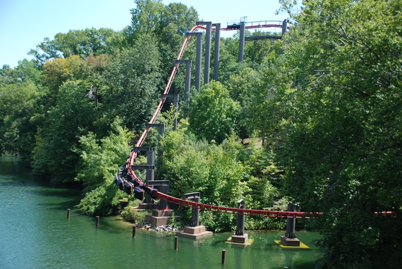
Big Bad Wolf's sweeping drop over the Rhine.
dsc_0707_937.jpg


Expedition Everest
p15024.jpg


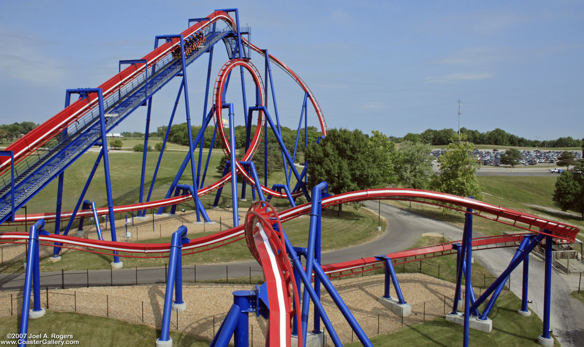
Nessie's world famous interlocking loops
p840.jpg
 

dj-fireball999

Mega Poster
Inverse said:
I don't really like Vekoma track, it's all very spiney and spikey, no elegance.

B&Ms and Intamins make nicer curves and i think they're more pleasing to look at... like a voluptuous lady.

I love the spiney and spikeyness of Vekoma/Arrow track. Makes it look interesting, a mix of angular sections and the cylindrical spine and rails are contrasting, which make it interesting.

B&M track is kinda boring in my opinion, no sense of soul, too simplistic. Intamin track (I know I will get loads of abuse from this because everyone on here hates me and wishes I was dead, just because I like Vekoma) - anyways, Intamin track, to me, looks too messy. BRING ON THE HATE!
 

Inverse

Hyper Poster
dj-fireball999 said:
I love the spiney and spikeyness of Vekoma/Arrow track. Makes it look interesting

The same way the Elephant Man is more interesting than Cheryl Cole?

normal_elephant_man.jpg

Cheryl%20Cole.jpg
 

CedarPoint6

Hyper Poster
I think Manta has risen to the top spot here in a lot of people's eyes. To me, that water splash alone is enough to do it.
 

gavin

Moderator
Staff member
Moderator
Social Media Team
^When are we going to stop touching ourselves over Manta? It looks very nice admittedly, but just because it's the best looking of the recent bunch of new coasters (hardly a major challenge) doesn't mean it deserves the keyboard wetting it's getting.
 

Danzibarr

Mega Poster
Inverse said:
dj-fireball999 said:
I love the spiney and spikeyness of Vekoma/Arrow track. Makes it look interesting

The same way the Elephant Man is more interesting than Cheryl Cole?

normal_elephant_man.jpg

Cheryl%20Cole.jpg

HAHA! Vekoma track just doesn't look 'solid' to me.

The best analogy would be Vekoma track being Knex, whilst B&M are Coaster Dynamix. I'm not saying Vekoma track looks like Knex coasters, but it just looks too 'gappy' and to me the gaps are what allows for more vibration and a rougher ride. Hard to explain but I know what I mean!
 

dj-fireball999

Mega Poster
Okay, fine. I'm wrong, as always. My opinions are just wrong. Everything that I say, is wrong. I should just stab myself, unless that's wrong too? :roll:
 

Snoo

The Legend
They never said your opinion was wrong, simply that they disagreed with it.

Not everyone has to gasm over Vekoma track ya know.. ;)
 

dj-fireball999

Mega Poster
Well it just seems that every time I mention the "V" word, everyone bites my head off for it. It's the same every time. I can't win. Vekoma can't win.
 

Inverse

Hyper Poster
^ Hey man, sorry if it felt like that. To tell truth i've enjoyed every Vekoma i've ever ridden (not that that's lots). I just don't find them asthetically pleasing, which is the subject of the thread. Plus I just spotted an opportunity for a funny and didn't want to miss it.
 

Maverix

Mega Poster
Silver Bullet, there's jsut so many great angles you can see of the ride, with the path underneath.
 

Rush

Giga Poster
Are you kidding? It's got a butt ugly colour scheme which has been dumped in what was once a really nice area I'm sure.
 

Maverix

Mega Poster
^Have you Been There? It's really nice in person, Manly the floater bank and final helix over the water. It's just my opinion though.
 
Son of Beast is actually a gorgeous coaster, too bad it's suppose to suck. Either way, huge wooden coasters have always been good looking whether they ride good or not.
 

Rush

Giga Poster
Maverix said:
^Have you Been There? It's really nice in person, Manly the floater bank and final helix over the water. It's just my opinion though.

I have... and I thought it looked awful, really barren and bare. Apparently that area used to be really nice but it got torn out for Silver Bullet.

Silver%20Bullet%20(36)l.jpg


Not nice.
 

A-Kid

Giga Poster
I personally find Patriot and Talon quite nice to look at.

Lovely colours.

Patriot02.jpg

p1604.jpg


Can't really fault the looks of a Beemer though.
 

Ben

CF Legend
Patriot I don't agree with. That stripe is HIDEOUS. If it was just red and blue, yes. But the STRIPE. Ugh.

Talon is fit though. Especially at night. And especially when riding it <3
 

Maverix

Mega Poster
Rush said:
Maverix said:
^Have you Been There? It's really nice in person, Manly the floater bank and final helix over the water. It's just my opinion though.

I have... and I thought it looked awful, really barren and bare. Apparently that area used to be really nice but it got torn out for Silver Bullet.


Not nice.

ehh, well I thought it looked nice the day I was there. Just my opinion though.
 
Top