CineramaMax
Mega Poster
Having seen the gold in the sun, it does actually look very nice, but the lack of a proper fade is very jarring, gives a lot of others I know OCD.
Maxx Force and Hyperia are completely different track profiles. Maxx Force has no trims and the profiling accommodates the speed. Hyperia's elements are elongated, the transitions are taken a much lower speed or trimmed....based off how much this ride is going to do in such a short amount of time, and with how aggressive it's going to be for the duration, I'm okay with the length of the circuit on Hyperia.
Most tall coasters built in the UK from here on out will probably adopt either the 2 colour scheme, or a neutral scheme, which does not stand out too much against the sky when viewed from surrounding areas. This is to help them get past planning objections such as "But it will be an eyesore."I'm sorry I probably missed something but I don't understand the 2-color scheme!?! What is the reason behind it? I rememeber the Blue Streak at CLP having 2 colors (fresh paint for the botton part about 10 feet high) because volunteers were painting it and were not allowed painting higher because of insurance issues.
You'd think considering the average weather in the UK they'd opt for slate grey rather than white.Most tall coasters built in the UK from here on out will probably adopt either the 2 colour scheme, or a neutral scheme, which does not stand out too much against the sky when viewed from surrounding areas. This is to help them get past planning objections such as "But it will be an eyesore."
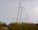
I did look at the photo posted by coasterfeck a few posts above mine and wonder why they didn't go for blue... Then I rememberedYou'd think considering the average weather in the UK they'd opt for slate grey rather than white.
???Maxx Force and Hyperia are completely different track profiles. Maxx Force has no trims and the profiling accommodates the speed. Hyperia's elements are elongated, the transitions are taken a much lower speed or trimmed.
There is only one confirmed trim at this moment, and that is the simulated splashdown. As is standard practice with a lot of Mack's coasters, brackets have been installed for trims before the outward banked turn/twist in case the train over-speeds, should that happen, only then will a trim will be installed.Maxx Force and Hyperia are completely different track profiles. Maxx Force has no trims and the profiling accommodates the speed. Hyperia's elements are elongated, the transitions are taken a much lower speed or trimmed.
I just don't understand this because the white doesn't look that pleasing to begin with. It's not like they were trying to paint it bright yellow or pink or something like that. If they really wanted a subtle color scheme they could've just gone with another grey or black, or even some sort of dark green.This is to help them get past planning objections such as "But it will be an eyesore."
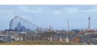
Hang on... I'll try and show you why they do it...I just don't understand this because the white doesn't look that pleasing to begin with. It's not like they were trying to paint it bright yellow or pink or something like that. If they really wanted a subtle color scheme they could've just gone with another grey or black, or even some sort of dark green.
Part of it's also the white track on white supports. Just doesn't go well.


I agree, construction and testing will still take a while. I think maybe it could be open in April or May (I have no idea, just my opinion).I would say it is safe to assume now that there is no chance this is opening along with the park in March?
I would assume we looking earliest late April for opening day?
