FORUMS - COASTERFORCE
You are using an out of date browser. It may not display this or other websites correctly.
You should upgrade or use an alternative browser.
You should upgrade or use an alternative browser.
Theme It! - An RCT3 Competition
- Thread starter reddude333
- Start date
The Grape Wizard
Hyper Poster
reddude333 said:Are you getting any particular error?
It just closes with a pop window 'Rollercoaster Tycoon 3 has stopped working'
The Grape Wizard
Hyper Poster
I've been downloading CTR's and things for months and never had a problem but since downloading this comp's CTR and track really. I know there is a problem sometimes with no svd:sid error, but it's not that, it literally shuts down for no reason
The Grape Wizard
Hyper Poster
Yeah I wish it was that haha!
But I can't load any previous parks it crashed halfway through the load. It does load new sandbox parks though, but literally lasts 5 minutes before it freezes and closes down
But I can't load any previous parks it crashed halfway through the load. It does load new sandbox parks though, but literally lasts 5 minutes before it freezes and closes down
The Grape Wizard
Hyper Poster
No luck :/
reddude333
Giga Poster
Hmm...that is quite a predicament. You might try uninstalling and reinstalling the game.
CoasterCrazy
Giga Poster
Rather unsurprisingly, I've been having a few technical problems. :roll:
I'm confident that I've placed the track file in the right place as you instructed, however, the CTR set was a little...challenging. Does the track not work at all without the CTR?
If so, that may be why. I haven't installed a CTR before, but here's what I did.
Moved to my desktop
Zipped it (?)
Placed each of the two folders in their designated locations.
Maybe this will be like my CS....I'll get there sometime...
I'm nearing completion with my entry.
However I am working out if there's anything else I can add. It's challenging because I don't want to add pieces of scenery for the sake of scenery. It needs to be in context with the theme.
I feel like my entry is very tight. I need to work out to what extent I need to work on regions of the land visible from the ride.
Wow. I havn't even started yet. Just had a little go now, and it looks very challenging. I had an idea, but i really don't feel confident with it and it would look very messy and just plain poor. I may resort to generic theming so I can present something to you guys. Ugh.
gopats1479
Mega Poster
I thought I should give an update. I am almost complete with my supports. My theme is set--just needs to be built. I am going to keep it minimal because I know if I try to pack everything chock-full of scenery it'll look worse than having less scenery.
My entry:
One Thousand and One Nights (1001 Nights)
My entry is Egyptian themed as you can tell. I wanted to situate the coaster into a valley. I was happy how everything came together.
I am thrilled with the pre-lift-hill drop as that area feels like you're dropping into some sort of ditch. The mid-break section fortunately lined up with my park entrance. Which makes it a great centerpiece for when visitors enter the park.
I found the balance of light and trees a challenge as I wanted to make the area interesting, without making it cluttered. I think I have achieved a nice compromise.
I recorded the PoV from the 2nd row of seats because of the camera's location. It's definitely not at head height. As a result, a PoV from the front row would mislead the viewer with regards to near misses (making them look like proper hits).
A different issue that arose from my insecurity of 'stuff', was 'What will I do with this vacant void of terrain outside of the valley?'. I had considered flooding it, and making it a sea, but I was paranoid that 'water overflowing the park boundary' was the reason a lot of my previous park-projects got corrupted. So, when I did build the 'sea', it was closer to being a pond. But there was nothing I could do about that.
My aim was to use this contest to start a new park, so I wanted room for potential expansion, but without having the void of 'nothingness' around the coaster (like my previous projects had) for the sake of the contest.
This was my first night-time-in-mind design.
I decided to utilise peeps to make the coaster look more 'alive'. Ghost-Coaster Trains sometimes look weird.
I can think of anything more to say. If I do remember something, I'll edit in later. I'm doubtful many of you will see this post for many hours anyways.
POV
[youtube]http://www.youtube.com/watch?v=hNINbmULmLc[/youtube]
Images
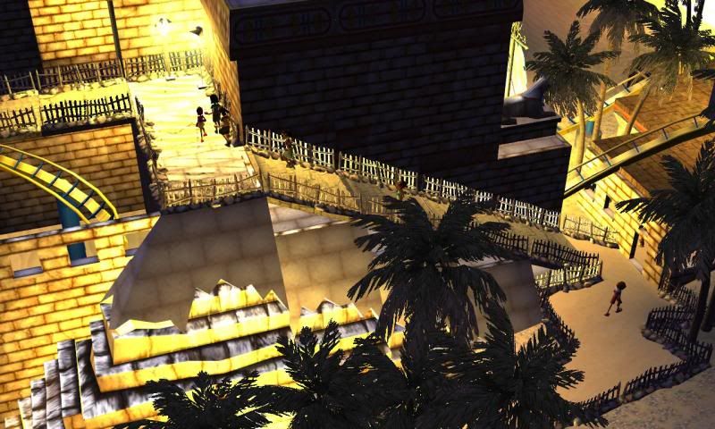
Queue with excited guests.
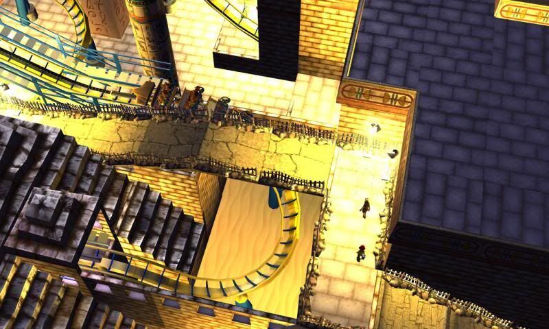
Drop into a ditch.
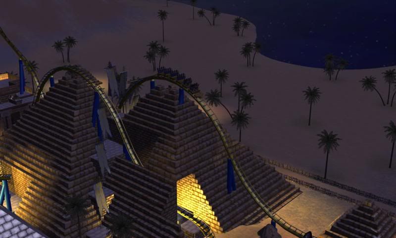
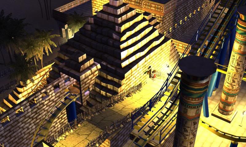
Station.
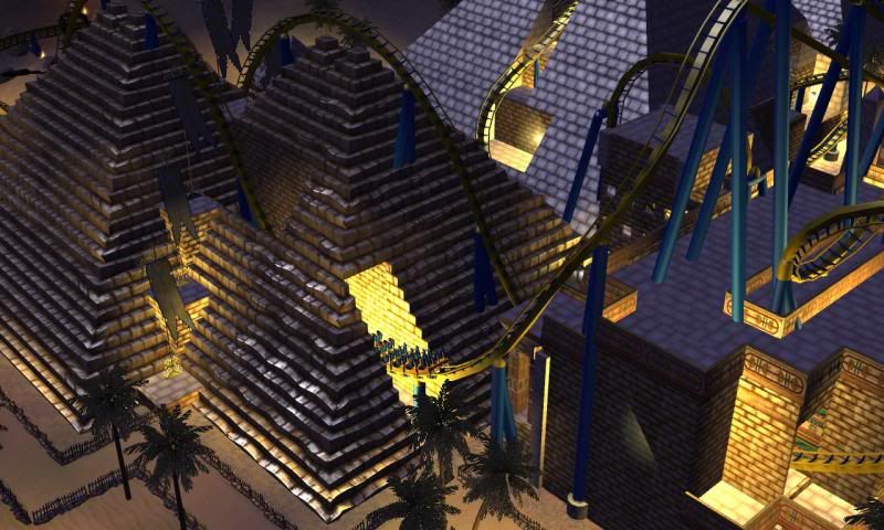
The first drop.
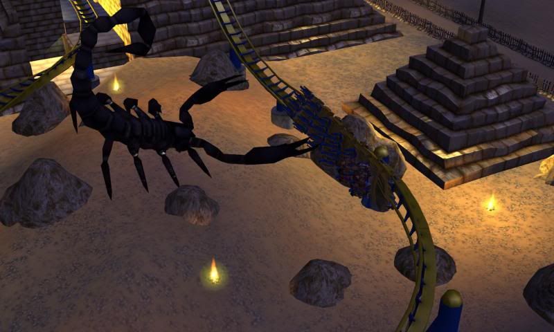
Rugged desert section around a friendly scorpion.
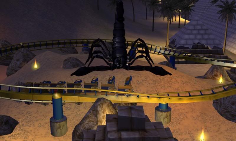
He wants a hug.
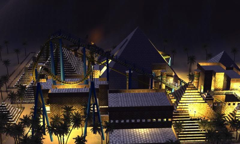
Lifthill. Blame photobucket/steam's file naming for the desynchronisation of images.
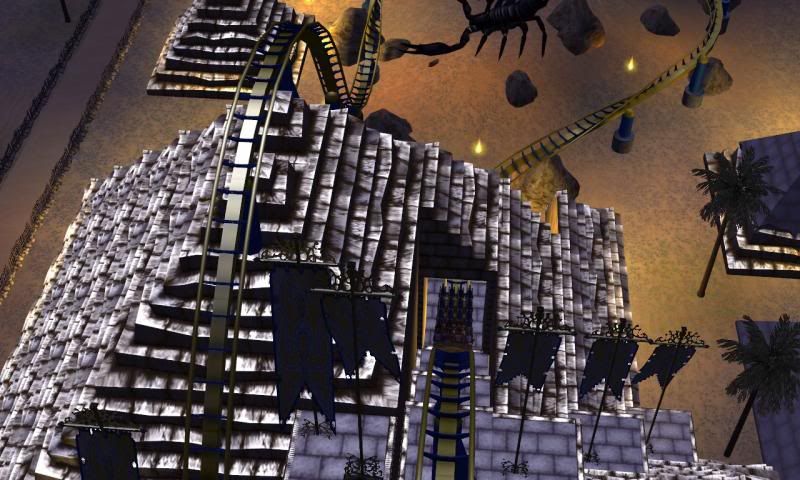
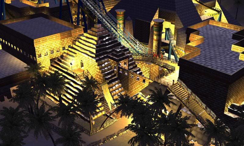
I'm fond of the 'tactile' nature of the weathered pyramid bits.
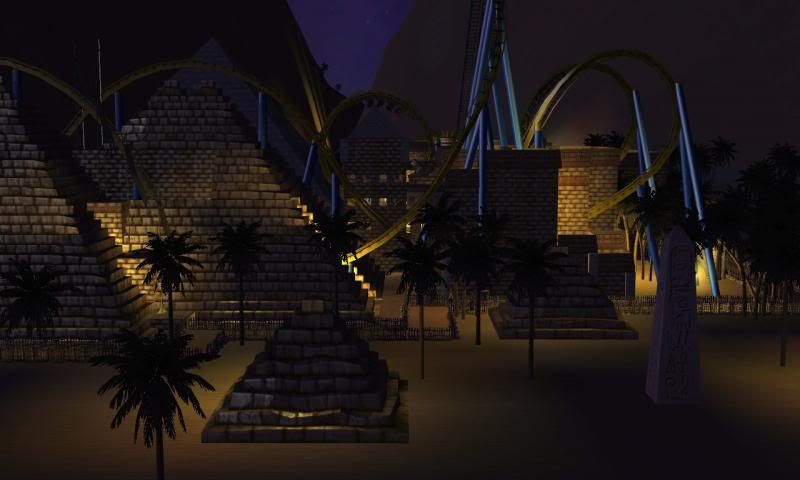
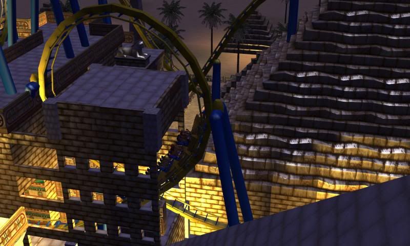
I like making vertical loops fancy. What can I say?
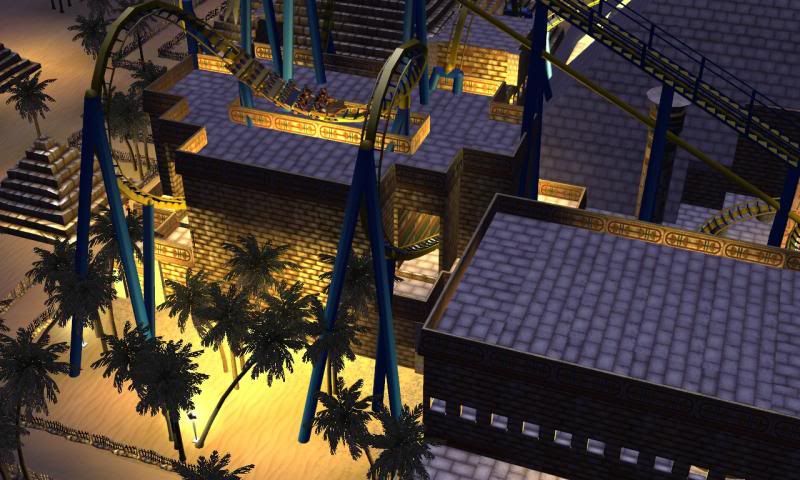
In fact I like making most inversions fancy looking. I adore the 'trough' for the mid-cobra roll, myself.
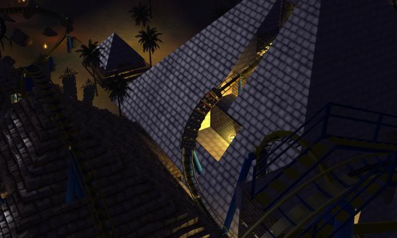
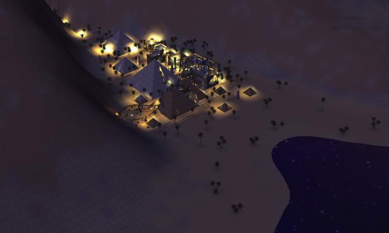
Many pyramids.
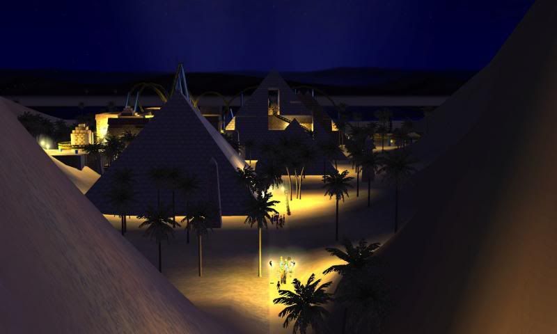
View from the park's entrance path.
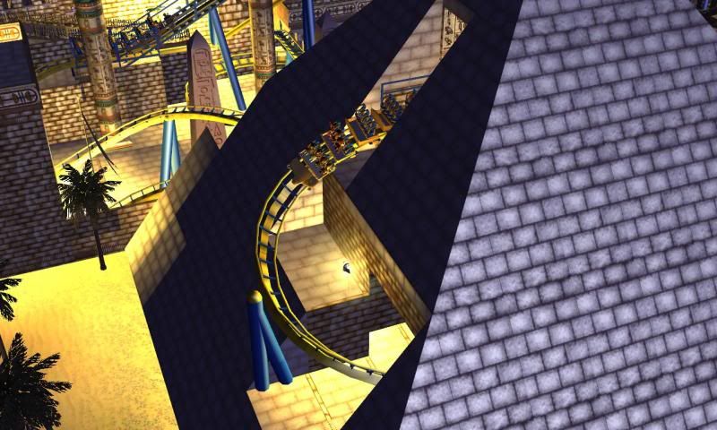
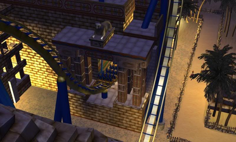
This happens earlier on. But everyone is using the same coaster layout, so it doesn't matter. What matters are the pretty things around this section.
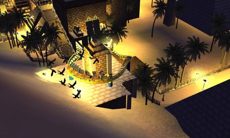
Logistical nightmare taking into consideration the hypothetical possibility of things 'falling from the train and hitting guests'. Dark brown tiling is health-and-safety.
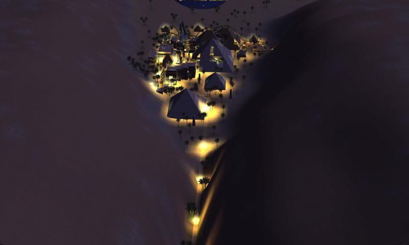
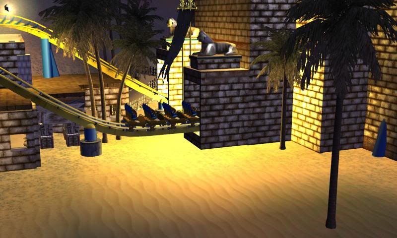
The interlocking corkscrews are indoors.
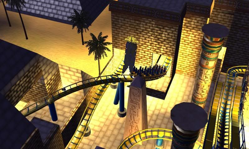
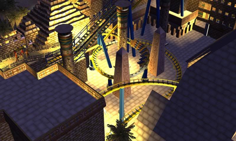
The courtyard.
One Thousand and One Nights (1001 Nights)
My entry is Egyptian themed as you can tell. I wanted to situate the coaster into a valley. I was happy how everything came together.
I am thrilled with the pre-lift-hill drop as that area feels like you're dropping into some sort of ditch. The mid-break section fortunately lined up with my park entrance. Which makes it a great centerpiece for when visitors enter the park.
I found the balance of light and trees a challenge as I wanted to make the area interesting, without making it cluttered. I think I have achieved a nice compromise.
I recorded the PoV from the 2nd row of seats because of the camera's location. It's definitely not at head height. As a result, a PoV from the front row would mislead the viewer with regards to near misses (making them look like proper hits).
A different issue that arose from my insecurity of 'stuff', was 'What will I do with this vacant void of terrain outside of the valley?'. I had considered flooding it, and making it a sea, but I was paranoid that 'water overflowing the park boundary' was the reason a lot of my previous park-projects got corrupted. So, when I did build the 'sea', it was closer to being a pond. But there was nothing I could do about that.
My aim was to use this contest to start a new park, so I wanted room for potential expansion, but without having the void of 'nothingness' around the coaster (like my previous projects had) for the sake of the contest.
This was my first night-time-in-mind design.
I decided to utilise peeps to make the coaster look more 'alive'. Ghost-Coaster Trains sometimes look weird.
I can think of anything more to say. If I do remember something, I'll edit in later. I'm doubtful many of you will see this post for many hours anyways.
POV
[youtube]http://www.youtube.com/watch?v=hNINbmULmLc[/youtube]
Images

Queue with excited guests.

Drop into a ditch.


Station.

The first drop.

Rugged desert section around a friendly scorpion.

He wants a hug.

Lifthill. Blame photobucket/steam's file naming for the desynchronisation of images.

I'm fond of the 'tactile' nature of the weathered pyramid bits.


I like making vertical loops fancy. What can I say?

In fact I like making most inversions fancy looking. I adore the 'trough' for the mid-cobra roll, myself.

Many pyramids.

View from the park's entrance path.


This happens earlier on. But everyone is using the same coaster layout, so it doesn't matter. What matters are the pretty things around this section.

Logistical nightmare taking into consideration the hypothetical possibility of things 'falling from the train and hitting guests'. Dark brown tiling is health-and-safety.


The interlocking corkscrews are indoors.


The courtyard.

CoasterCrazy
Giga Poster
What a great first entry! Before I say anything else, I'd like to notify everyone that I will regrettably not be entering this competition due to inevitable CTR issues that will probably end up being solved next year :--D
Anyway, on to the coaster. Firstly, I love your usage of the in-game Egyptian scenery and quite sparse use of CS (when I build coasters now, I tend to neglect in game stuff) and also your magnificent lighting.
As a ride experience, I would say you've done a perfect amount of theming for the majority of the ride and the colour scheme works extremely well, and the glimpses in the queue of the ride and path interaction add to an already immersive experience.
My few criticisms relate to the adorable scorpion you've placed. Yes he's ever so friendly, but he doesn't particularly fit in, and perhaps it would be better if you had left it as dunes and maybe placed a tunnel in there. The only other problem is the entrances to the pyramids, but that's a limitation of the game.
Well done
reddude333
Giga Poster
First off, great entry scw55! I will leave further comments until judging...
I know I haven't been on in a while but I wanted to check up on everyone and see how their entries are coming along. I know Nick is done with his but I'd like to get somewhat of a head count for who all is planning on submitting an entry.
Thanks and happy theming!
[Edit: I'm terribly sorry to hear that CoasterCrazy. Please PM me and maybe we can work something out]
Hello everyone,
If I'm honest, I havn't actually started my entry. Nor have I actually thought of an idea for it! The layout is really compact and nothing immediate comes to mind, as it is a very generic ride type. (For example, if it were a flying coaster, I would have thought of incorporating flight into my design.) The chances of me getting any type of entry in is very low. Also, scw55's entry is flipping amazing, so that doesn't exactly give me determination to make a cool entry. Frankly, I just need an idea I am happy with! If I had a good idea, I could still get my entry in on time. Would anybody care to give me some inspiration? Even if I don't get my entry in, I will enjoy watching everybody else's ideas.
If I'm honest, I havn't actually started my entry. Nor have I actually thought of an idea for it! The layout is really compact and nothing immediate comes to mind, as it is a very generic ride type. (For example, if it were a flying coaster, I would have thought of incorporating flight into my design.) The chances of me getting any type of entry in is very low. Also, scw55's entry is flipping amazing, so that doesn't exactly give me determination to make a cool entry. Frankly, I just need an idea I am happy with! If I had a good idea, I could still get my entry in on time. Would anybody care to give me some inspiration? Even if I don't get my entry in, I will enjoy watching everybody else's ideas.

