What's new

scw55's Mini-Monsters Contest

reddude333

Giga Poster
Please extend this a few days so that I can submit my entry. I tried to bring the file with me on my trip but I failed at saving the file to my flash drive. My ride is done and the video is almost complete but I can't finish it here.
 

scw55

Hyper Poster
Extension of 7 days. Closing date changed to 8th of September
Suites me fine as things were a little hectic this weekend that I almost forgot I have a contest to start to judge :p

I also have been absorbed by Guild Wars 2 and League of Legends having a fun champion rotation.
 

gopats1479

Mega Poster
Here's my entry: Hurricane.
It is in my Plymouth Farms park project. The entire coaster is over a lake around an island that houses the station.
Here's a shot of the entrance to the island.
Shot0000.jpg


An overview of the ride's layout and setting.
Shot0001.jpg


A shot of the second lift.
Shot0002.jpg


I used the Dasmatze Support Overhaul for the supports, as I find wooden coaster support work really tedious and complicated. Here's some stats of Hurricane:
Top speed: 40.9 mph
Length: 2541 ft
Max G's: 2.89 g
Min G's: -1.12 g
Airtime: 0:17
Drop height: 58 ft

And finally, a POV. Enjoy!
[youtube]http://www.youtube.com/watch?v=gPJSyTlnDB0[/youtube]
 

reddude333

Giga Poster
In the middle of the Egyptian Sand Sea lies a seemingly deserted ancient temple. Myths tell that the Egyptian goddess Selket once dwelt here but has left behind one of her prized belongings. Do you dare to venture into the unknown?

Scorpio
Stats:

Max Height: 58ft
Max Speed: 42mph
Track Length: 1740ft
Ride Time: 55 seconds

First drop and inversion
Scorpio1.png


Train completing the "drop corkscrew" element
Scorpio2.png


Take a ride on Scorpio
[youtube]http://www.youtube.com/watch?v=htlvFe_W5pY&feature=youtube[/youtube]
 

scw55

Hyper Poster
Mmm, it's going to be fun to judge the merits between an inverting layout and a non-inverting layout.
This contest has gotten a lot more interesting.
Thank you gopats and reddude. Lets hope the others are able to contribute something. The day is yet still young.
 

Coaster Hipster

Giga Poster
Very curious layout derek. I like the colour scheme (though it's similar to UNcharted's) and original inversions. Nice overall atmosphere, in particular.
 

reddude333

Giga Poster
Thanks portemine, it means a lot coming from you. And yes, admittedly the color scheme is similar but I was planning on making it orange at first if that's any consolation. The yellow just worked better with the landscape and theming though. Its a shame you were not able to enter into this comp. Hoping I can still scrape up an entry for your contest though.
 

scw55

Hyper Poster
-Entry Period is Closed-

Marking system reminder
The scores will be based on a 60%:40% ratio of My Score and Average Forum Score.

This means, I would humbly ask any forum users who wishes to to PM their scores for the three entrants' creations;
gopats, reddude and InTricks.

The criteria to grade them is up to you. Please state which area you're grading them on so I can write a fuller critique at the end.

Any extra comments you can give or reasoning would be helpful and interesting for the above reason as well.

I would like to finally say that I am very happy that all entrants had managed to understand my really weird concept for a building challenge and embodied the philosophy very well.

Let the PMing begin!

I would like all PMs to be in by next Saturday if possible. September the 15th. Thank you :)
 

reddude333

Giga Poster
^3 entrants...don't forget InTricks.

Btw, what do you mean by "area you're grading them on". I'm just a little confused as to what you are asking for. Also, I'm guessing I grade myself, yeah?
 

scw55

Hyper Poster
Crap sorry :&

yes, Intrick'sentry found on page 3.

- I mean, um, category? Like, Realism of track. Custom Support use w/e you feel the need to take into account for this contest.

Yes, please submit the score for yourself reddude, gopats and InTricks.
 

Colossus

Giga Poster
Derek I have to say I really like your ride, the atmosphere is exceptional, I love that its all in the dark, layout is good and the camera work is top notch, great job mate.
 

scw55

Hyper Poster
Results are coming shortly.
I was going to start writing them up but unfortunately my cat has fallen ill (again) so I'll be more occupied than I normally am for a few days.

If you haven't sent me your scores for the entrants, now's a good time.
 

scw55

Hyper Poster
No it's not. I hope to being able to start pulling things together tonight and hopefully be able to post something this Friday.
 

scw55

Hyper Poster
In Third Place is: Intricks with his Flyer Coaster : 50%

The pre-lift hill section was a very nice addition. It utilised the starting elevation of the station and allowed the riders to taste what was going to come. Sadly (as a result of height restrictions) this section's pace felt quite slow for the elements used.
The threading of the eye of the vertical loop was a sweet touch. However it felt slightly clunky how the sequence fitted together. The velocity I felt for the bend through the loop was a bit low to warrant a banked turn. The final turn into the station feels like it shouldn't really be banked.

You needed to have had more time to sort out the landscaping. The blocky nature of the terrain kinda does imply a quarry, but even land that has been brutalised by machinery don't have flat vertical cliffs. It tends to be sloped very steeply at most. Some of the textures needed to be blended better by having the transition to be on the same plane. The water is a nice touch but doesn't really have any justification of existing besides for the sake of it.

Sadly the chosen colour scheme seems bland and doesn't really relate to any theme the ride might have. There also isn't a justification for the colour which means there is no reason for why it shouldn't be scrutinised.

Thank you very much for contributing. Sadly your technical problems and time issues hasn't allowed you to submit a refined entry.
 

scw55

Hyper Poster
In Second Place is GoPats with his Woodie: 68.75%

The colour used for the whole design including station pieces whilst whilst being traditional works very well. There is nothing wrong with being traditional if the whole thing looks fine. The water-mass makes sense due to the name of the ride; Hurricane. Hurricanes form over massive water masses like Oceans so the lake isn't 'out-of-place'. Plenty of twists and bumps to make the layout feel engaging.

However the use of the second lift-hill is quite unfortunate. It breaks up the flow of the layout but it has been incorporated well, so it's not a major problem. However, despite how restrictive the track options are for woodies (especially with a height limit), the layout could have been more varied. Doesn't take away that the overall appearance looks good.

You were able to make a layout that looked interesting from afar and was enjoyable to watch in a PoV. The additional elements outside of the layout didn't conflict with what you achieved with the layout. The reliance on the Second Lift hill was unfortunate, but its tactical positing was good enough that it wasn't really a problem. Thank you for contributing this very interesting un-inverting coaster. In my experience of trying out this 60ft limit any non-inverting layouts ended up looking very dull, so I applaud you for creating something of interest. Thank you very much for taking part.
 

scw55

Hyper Poster
In First Place is Reddude with his Steel Inverting Coaster: 92.5%

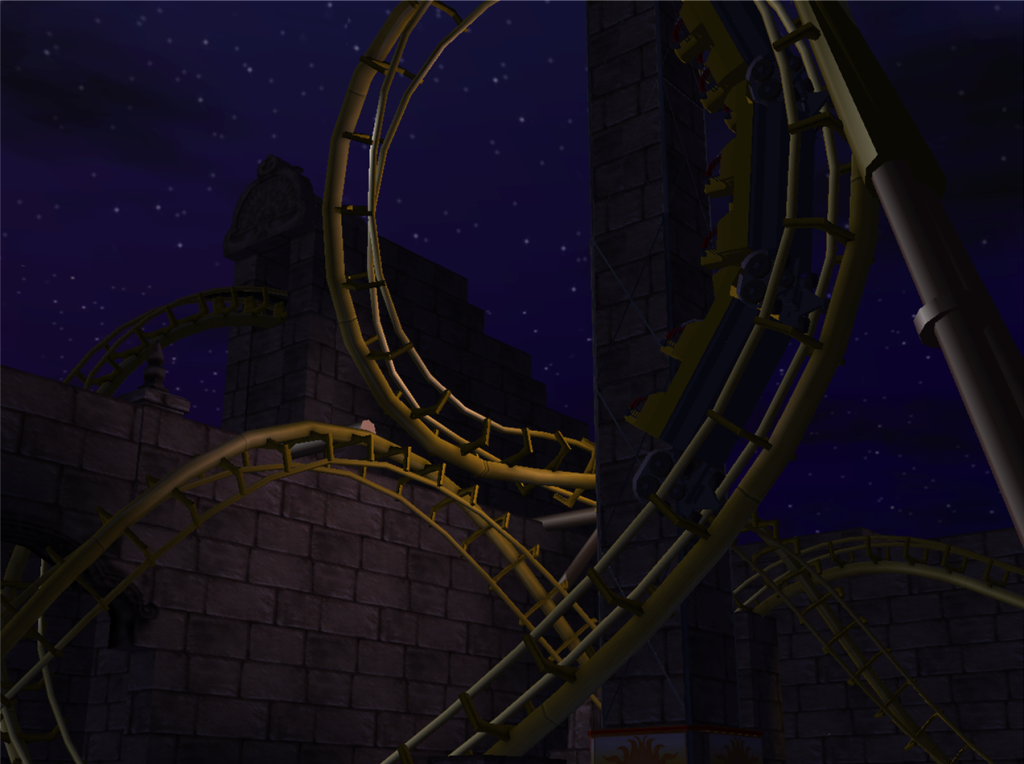
There is some much little things that make this entry a worthy winner. Most note-worthy in my eyes, but also the smallest is the support work. Yes the CTR Supports look flawless, but what I really find exciting is the inventive supports. Some supports are scenery pieces such as columns that are used for supports. I friccing love themed supports. I really dislike it when with regarding supports you're meant to ignore them because they are doing a practical function. I like supports which are integrated into the actual design and theming of the coaster; Nemesis' rusted effects on the supports which are meant to be Steel that is pinning down the Creature. The themed supports helps the coaster fit better amongst the themeing. It's very weird seeing a steel structure wrap itself around Arabian architecture. But, the themed supports, and carefully considered colour scheme of the non-themed supports and track helps the integration.

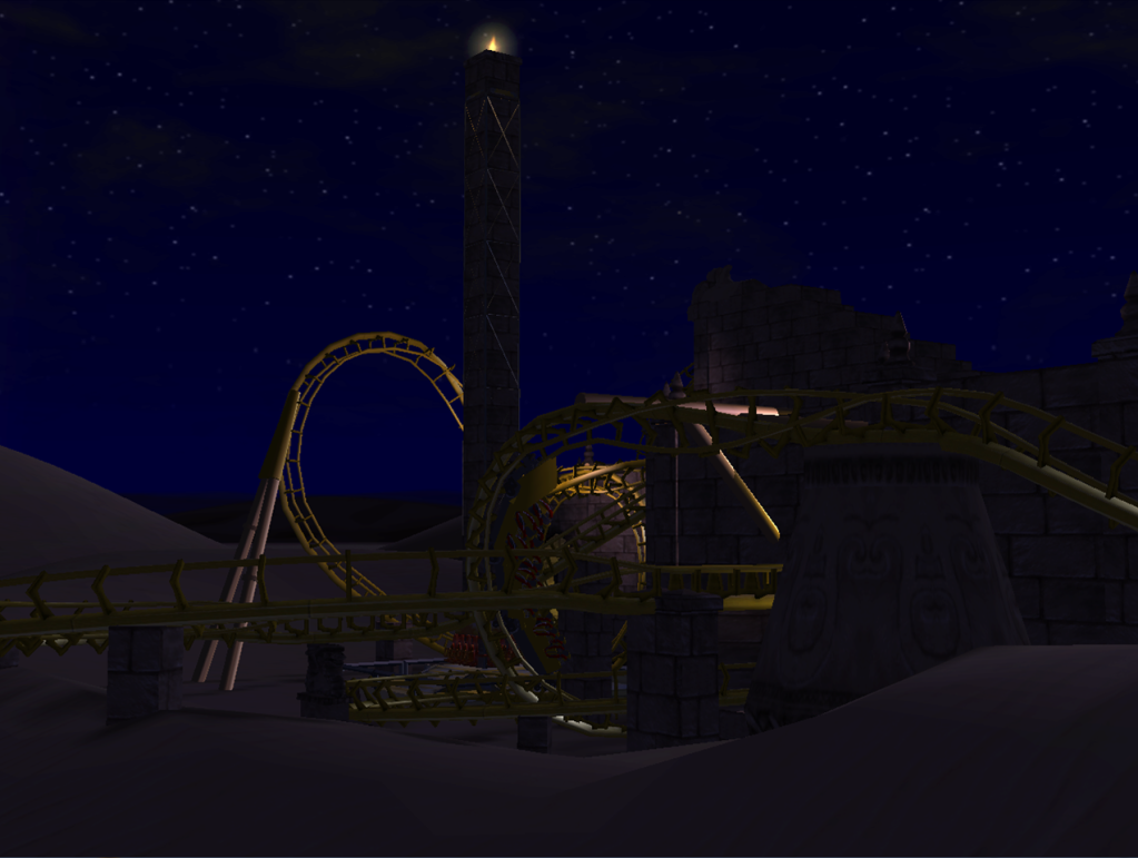
The scenery is well done. But I am not marking how pretty the scenery is. I was marking how the scenery is used. The scenery successfully helps the layout look good, exciting, enjoyable and other happy words despite the height limit. Without the scenery the coaster could risk looking very slow and sluggish. The scenery gives the illusion of speed. Mainly because you're more conscious at if you might bash your head on some rock rather than what speed you're going at;- a good thing

Now onto the actual layout. I love the first drop. I adore misdirection on coaster layouts which are often achieved with steeped twisted track. The first drop you are confused at where the track is. All you see is a stone floor ahead. You think you may die. Or you hope the track gets much steeper. But SURPRISE, it twists sharply to the left and catches you off guard. The only way this could be perfected careful positioning of the track later on so when the train is going down the drop, you think you're going straight down onto the track ahead. But instead you swerve to the side. There is a nice section which is a series of heartline twists, corkscrews and banked turns that maintain the same direction of rotation along the axis of the track. This section works well by itself. But also implies the idea of a sandstorm based off the theming.

I also get exciting watching the trains go along the track from a-far.

A very strong entry and a worthy winner. You didn't have to go to all this effort but I think it was worth it.
Congratulations :D
 
Top