What's new

Picture of Nemesis' Corkscrew: The Wrong Way?

Brookes

Giga Poster
I'm not sure whether this has been brought up before but this is one that has bugged me for a while. In the picture below, it appears that it is Nemesis' first corkscrew but appears to be going to the left instead of the right. I may be wrong, but is it something done by the use of editing the photo or something?
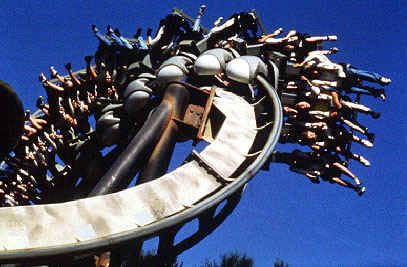
NemesisAlton.jpg


[EDIT BY IAN: Please note that this question has been answered. Please refer to Ian's post a few below before responding. Thanks.]
 
Well done Sherlock and Watson!

Erm, a quick :lock: before this spirals out of control!
 
Hmm, I'm tempted to unlock this but change the subject slightly.

I wonder how many ride images out there have been edited BY PARKS (NOT ENTHUSIASTS) for promotional reasons.

So yeah, as furie said, the original question has been answered (so please don't answer it again!) but I'm interested to see if anybody can find any.

Sorry to hijack your topic, Brookes, but the question has been answered and I don't think my question requires a new topic, call it evolution!
 
I'm not even sure why they need to do it. An image is an image, and if it's just a small pic of the ride then I see no need to flip it.
 
^Like Ian said, for promotional purposes.

For example, if they wanted the text on the right of the leaflet not the left. If the image is flipped the sky is then the right way round. Just an example, but it's quite obvious.
 
Pictures always need to be adjusted to look better. I'm sure that most images look crap unless they are tweaked.

I'm no expert on photography, but I know that for a photo to look it's best, the main light source has to be in a certain place and the main part of the picture has to be in a certain place too.

It's just making the picture look better, I suppose...
 
There's that photo where Shockwave's going the wrong way round it's loop. God knows where it is, but, it's lolerz is someone can find it.
 
The only one I can think of is Obliterator from Pleasure Islands website. Last year they had the ride upside down and facing downwards on their main page. It looked a bit odd but must have fitted in better with the rest of the design.
 
Yes, correct it is :p

I can see why they would do that, the Intamin restraints don't look half as good and don't look like the handles are in the correct place.

TBH I would love to go on Rita or Stealth with those restraints.
 
Inverse said:
Stealth's promotional image is a B&M.

Hey, that's just like the new Al... Oh, wait... No, not allowed to say anything ;) :p
 
If we're really going to pick holes in that Stealth picture the man at front right is also sat in 3rd left. 2nd Right is 4th left and 2nd left is 4th right.
 
Actually Razz.. Its a Fabbri.. Those are the restraints from Detonator..

Are you sure? I mean, I'm just confused by the fact Det's are a different shape... and colour :p
 
Top