What's new

Hansa Park | Kärnan | Gerstlauer Hyper Coaster

Mysterious Sue

Strata Poster
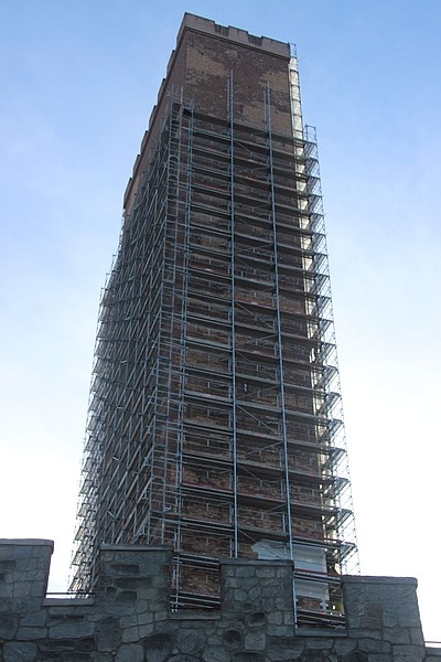
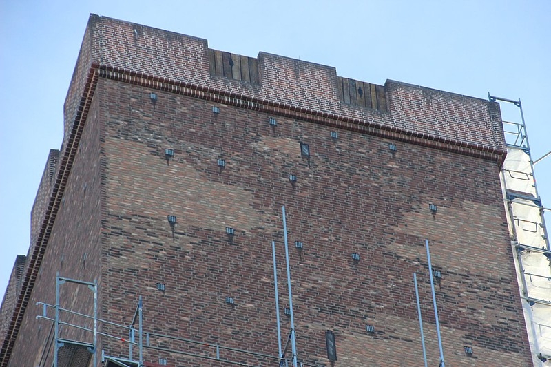
That's ridiculous! From an enthusiast point of view, I'm glad they are finally theming it, and to a high standard. But bricking the front of the whole structure is going to cost a small fortune surely? Such an odd decision from the park.

Perhaps I'm just too used to Merlin who clearly would have just left it bare rather than spend any money.
 

Ben

CF Legend
Oh finally!

But yes this thing is HUGE. It's weird I got the cred like a year ago and it's still being done haha.
 

Pink Cadillac

Giga Poster
get ready for your closeup
f3157f5c92.jpg
 

EthC

Mega Poster
EDIT: Moved these posts from the "New for 2017" topic - Hixee

I dont know if this has been posted anywhere but yay for the Karnan tower being themed!
9e4315519a.jpg


40260732f8.jpg

9453240d1480710836-2015-neuheit-der-schwur-des-kaernan-hypercoaster-gerstlauer-hansa-park-2_mg_8602.jpg


9454491d1482580329-2015-neuheit-der-schwur-des-kaernan-hypercoaster-gerstlauer-hansa-park-k-hapa-winter-2016-15-.jpg

9454494d1482580330-2015-neuheit-der-schwur-des-kaernan-hypercoaster-gerstlauer-hansa-park-k-hapa-winter-2016-28-.jpg

9454497d1482580331-2015-neuheit-der-schwur-des-kaernan-hypercoaster-gerstlauer-hansa-park-k-hapa-winter-2016-37-.jpg
 
Last edited by a moderator:

Hixee

Flojector
Staff member
Administrator
Moderator
Social Media Team
Karnan is brilliant, but that tower looks ****.

I'm sure the low level stuff and all the internal theming will be excellent, but the tower just looks so daft. Shame...
 

jayjay

Giga Poster
Looks like they've gone for the "realistic but scaled up" version. Apart from the octagonal tower (staircase persumably), it's not far off, but doesn't quite work at this scale

2864000-Karnan-Tower-Helsingborg-Sweden-0.jpg
 

gavin

Moderator
Staff member
Moderator
Social Media Team
Horrible. Hopefully they can get some paint on there or something to even it all out a bit. I can totally see what they were going for, but it hasn't worked.
 

Pokemaniac

Mountain monkey
Staff member
Administrator
Moderator
If only the roof of the tower was more interesting, they might have gotten away with it. Some interesting cornices, crenellations, little spires... just anything to add a sort of "crown" to the tower and break up the silhouette, it would have gone a long way. Right now, it looks too monolithic and too monotonous to work properly.
 

Lofty

CF Legend
But the point of the tower is to portray height and foreboding, the best way to do that is by harsh vertical lines into the sky and this is why it works perfectly. The sooner you start to add different shapes at the top, you start to create a focus point in which the height looks smaller. I completely get why they did this, not that I like it, but it makes a lot of sense.
 

davidm

Strata Poster
Must be me, but I think it looks just fine - really don't see what hasn't worked? :confused:
Vast improvement on the concrete tower anyway.
 

gavin

Moderator
Staff member
Moderator
Social Media Team
It's the patches of different colours which clearly show that the whole thing is new and fake. Yeah, it IS new and fake, but by blending those colours more, it would look miles better.
 
Top