dropthefloor93
Hyper Poster
Worst paintjob is a totally different story but some rides have just awful colour schemes.
Most B&M Hypers have just annoyingly rainbow colour schemes. I love the paint on Apollo because it doesn't make the ride look like it was produced in the East Village.
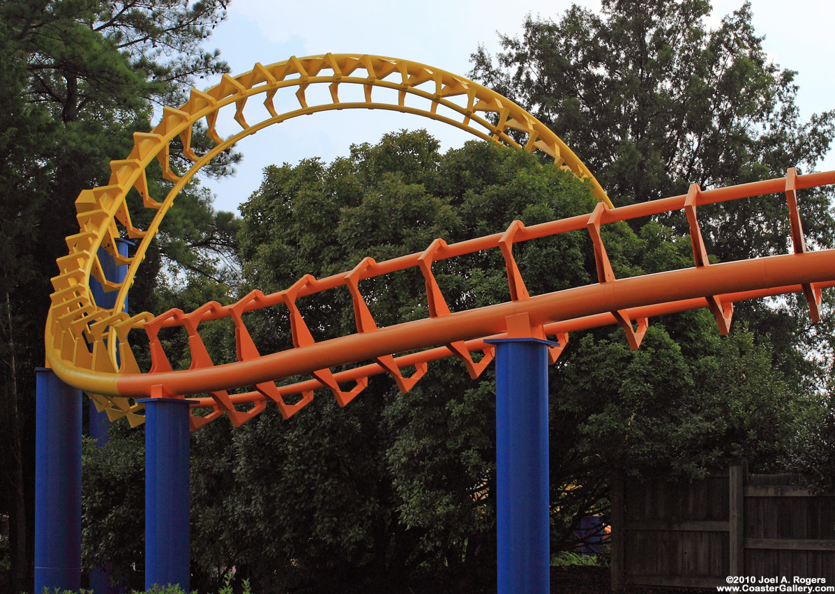
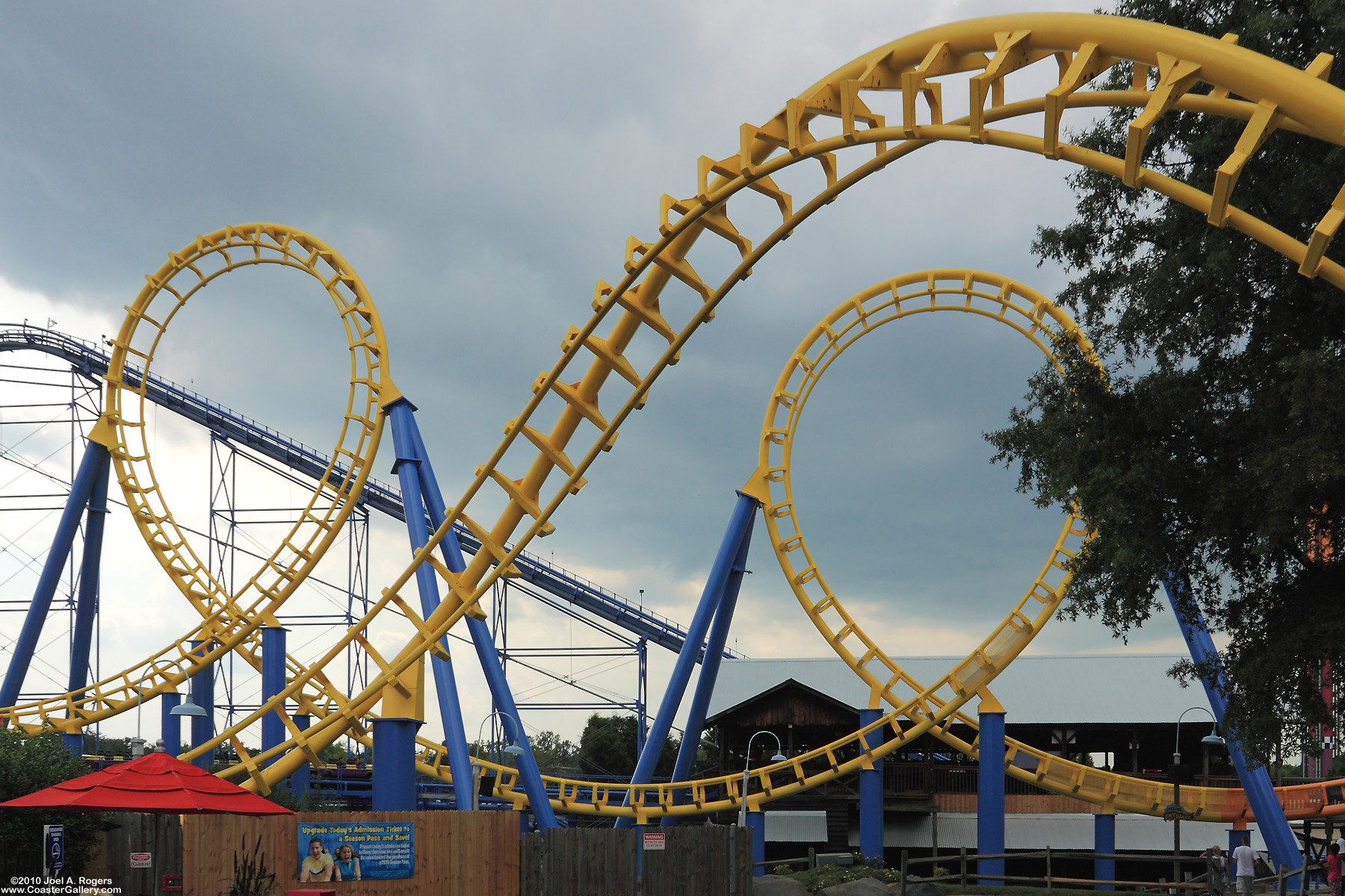
I'd have to say Talon has the worst colour scheme. That **** looks like it popped out of a crayola box.
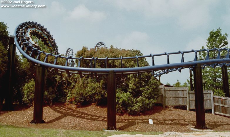
On the flipside, I think Apollo's Chariot has an amazing colour scheme that blends in with the scenery. But my pick is Dragon Mountain. The colour is just so... natural last time i checked.
Most B&M Hypers have just annoyingly rainbow colour schemes. I love the paint on Apollo because it doesn't make the ride look like it was produced in the East Village.
I'd have to say Talon has the worst colour scheme. That **** looks like it popped out of a crayola box.
On the flipside, I think Apollo's Chariot has an amazing colour scheme that blends in with the scenery. But my pick is Dragon Mountain. The colour is just so... natural last time i checked.
")