What's new

Most Beautiful coaster

nadroJ

CF Legend
"eye of the beholder" and all that!

Yh totally agree there, it was more the 'and your point is' comment that gave me the hump. It's just stupid and childish rather than actual discussion.

And I still stand by my argument that a rusty old Schwarz would definitely get swiped left.


Sent from my iPhone using Tapatalk
 

jayjay

Giga Poster
As much as they ride horribly, I'm a fan of the presentation of Big Loop and Limit at Heide Park. If they could give Big Loop a repaint, it'd be even better.

mUkZXmY.jpg

XuNWfxV.jpg

And while we're at Heide, bonus Bob
CwXMa5P.jpg
 

nadroJ

CF Legend
^I kind of see what you mean with that? They've got a well-manicured old school charm to them. Defo need a lick of paint though. Again, with the Bobsled i think it's the building that makes it!
 

Chris Brown

Mr CoasterForce 2016
Yh totally agree there, it was more the 'and your point is' comment that gave me the hump. It's just stupid and childish rather than actual discussion.

And I still stand by my argument that a rusty old Schwarz would definitely get swiped left.


Sent from my iPhone using Tapatalk

To be fair Jordan you did waltz in, tell everyone they have bad taste and then not provide any actual examples of beautiful coasters until asked. And when olaf did ask you got the hump and called him stroppy :rolleyes:
 

nadroJ

CF Legend
I was on my phone at the time which made it very hard to get pics, and I was actually writing my post with examples as Olaf posted. I guess context is everything.

And also, I think my tone was completely misread in the original post. It wasn't meant to be dicky, but I guess I forget that enthusiasts are the most sensitive people in the world and everything has to be SUPER SERIOUS all the time ;)
 

Chris Brown

Mr CoasterForce 2016
I was on my phone at the time which made it very hard to get pics, and I was actually writing my post with examples as Olaf posted. I guess context is everything.

And also, I think my tone was completely misread in the original post. It wasn't meant to be dicky, but I guess I forget that enthusiasts are the most sensitive people in the world and everything has to be SUPER SERIOUS all the time ;)

I know your comment wasn't Dicky at all, it made me laugh (it also happens to be true, there is some awful taste) aha

But i'd also say this comment wasnt being Dicky either,
... and your point is :p

I think we all see beauty in different things, I think that parks with lots of rides on top of each other because of the engineering... and engineering is beautiful!

And it certainly isn't anything for enthusiasts to get sensitive over! ;)

Yh totally agree there, it was more the 'and your point is' comment that gave me the hump. It's just stupid and childish rather than actual discussion.
 

nadroJ

CF Legend
Nah, the 'and your point is' post wasn't dicky, but it was stupid and pointless, hence why it gave me the hump. Well, not even the hump, just major eyeroll. Like I said, don't post a load of pics trying to explain your point to me then post a pointless reply when I still disagree. It's dumb.
 

Snoo

The Legend
I've always found Millennium Force at night to be a beautiful coaster. It does look good during the day but it shines at night IMO. I think most Intamins share that quality, just because of the flow of the track.
 

Pink Cadillac

Giga Poster
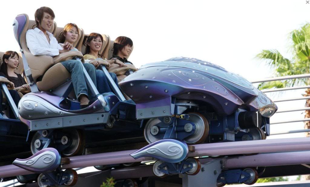
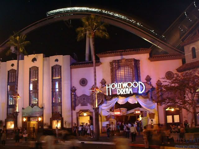
Hollywood Dream always looks like she just stepped off the red carpet.
f52ac14b92ada9bef78a8c6dc530f433.jpg

Love the subtlety in the colour scheme. Soft pink rails and pale lavender track. Also, white supports always please me.
The trains are to die for.
Fancytrain.jpg

A regal disneyfied-fairytale aesthetic, but still looks very modern.
osaka-japan-people-enjoy-a-ride-on-the-new-roller-coaster-hollywood-picture-id73522046

It has a sleek grey lift hill
Hollywood_Dream_11.jpg

And it's dazzling at night.
p417.jpg

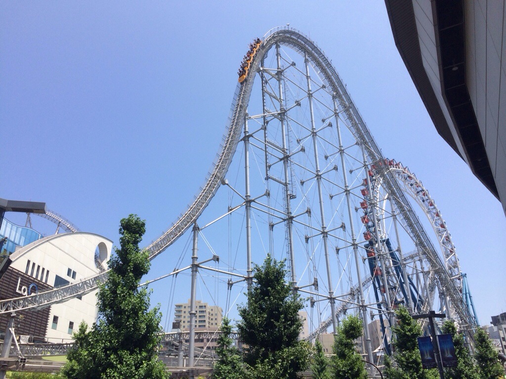
Also obsessed with Thunder Dolphin's supports
20140728-211916-76756188.jpg
 

SilverArrow

Certified Ride Geek
Schwarzkopfs are many, many things, but lookers, they ain't.

As much as I hate to give that ride any more hype than it already has, you simply can't not mention Taron in this thread, and even moreso Helix because of how amazing the landscaping and intertwining with various other rides is.

Nooo blasphemy! I actually think their looping star/ silver arrow/ looper (OL etc) track is pretty, but then I like the retro look.

And anyone who has mentioned taron...
https://rcdb.com/1200.htm#p=5619
It's practically the same!
Yes, I AM suggesting Knightmare is (was) pretty haha.

And this...yasss
https://rcdb.com/492.htm#p=438

There are, of course loads of B&Ms that could feature in this thread.
 
Last edited:

Crosscoaster

Roller Poster
Yh totally agree there, it was more the 'and your point is' comment that gave me the hump. It's just stupid and childish rather than actual discussion.

Well I do apologise for offending, it was purely meant as a bit of banter. It's been a while since I regularly posted on a forum, and this is probably why. I was only saying what I thought as a bit of fun. I didn't realise it would cause an argument!
 

TLARides

Hyper Poster
I have to say Smiler. A lot of work went into it. The Marmaliser in the middle really makes it unique (besides its extensive amount of inversions). There's a lot of theming that messes with your head too, such as the stretched logo and "Process complete" sign on the end of the ride, as well as the screens inside with all the mind manipulating photos.

The "Staffordshire Knot" is a neat track visual element too.
 

TommyAlex

Mega Poster
I think the best looking coasters are the shiny, bright coloured B&Ms. The only bright colour one I don't like is Nitro. Hydra looks great, as do the black and yellow Batmans, and Leviathan, to name a few. Don't like the B&Ms with white/grey supports though, like Intimidator and Fury 325.

For wooden coasters, any painted white look great, as does Twisted Collossus. Plus Nickelodeon Streak and Blue Streak look great in bright colours.

Plus Revolution at BPB. But then I love everything about that coaster. Except for when it was blue and orange. Terrible colour scheme. But it looks great in metallic silver now.
 

CrashCoaster

CF Legend
Plus Revolution at BPB. But then I love everything about that coaster. Except for when it was blue and orange. Terrible colour scheme. But it looks great in metallic silver now.

I personally think Revolution would look nicer if they painted the rails red to match the lights used on the coaster at points, but that's just my opinion. :)
 

Alaeriia

Roller Poster
I personally love the look of the Boomerang at Lake Compounce. The purple track and iridescent trains are gorgeous. Also, the first three cars ride surprisingly well.
 

HeartlineCoaster

Theme Park Superhero
As pure hardware, always found B&Ms to be the easiest on the eyes.
A nice setting or theming can help most things though, then there's almost too many to name.
 
Top