
You are using an out of date browser. It may not display this or other websites correctly.
You should upgrade or use an alternative browser.
You should upgrade or use an alternative browser.
Alton Towers | Nemesis Reborn | B&M Retrack | 2024
- Thread starter Matt N
- Start date

I think it's because this is zoomed in and from the observation deck which we would never have seen it from this angleIs the assumption that all track profiling is staying exactly the same as the original?
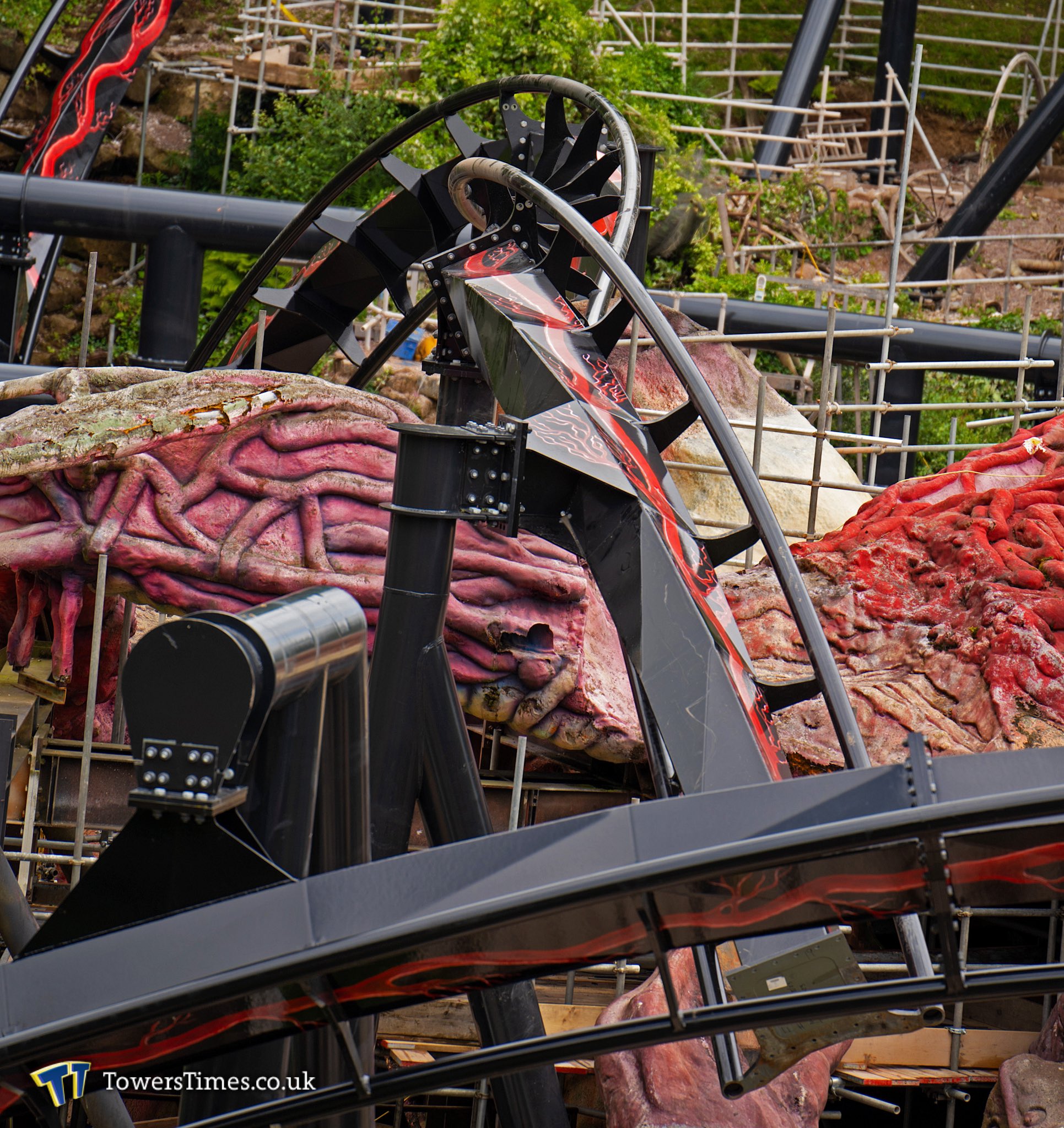
Maybe it’s just the angle but I don’t recall the zero-g looking like that before…
spicy
Giga Poster
I really hope they go all out on the theme for the station. Would love to see a new near miss element on the Zero-G with the veins/monster grabbing the supports kind of like how they are on the forbidden valley sign but a better fresher look.

With them being so bold with the vein design on the track and how they have gone all out with the Phalanx story so far, I am expecting big things for the theme on the station/trains and the rest of the area.
With them being so bold with the vein design on the track and how they have gone all out with the Phalanx story so far, I am expecting big things for the theme on the station/trains and the rest of the area.
Swat
Hyper Poster
The fact they could easily have the track complete by the end of the summer means they must have big plans for theming.
I hope they add to the story during fireworks as well, I can see them making people head over after the fireworks and seeing it test to add to the hype for next year.
I hope they add to the story during fireworks as well, I can see them making people head over after the fireworks and seeing it test to add to the hype for next year.
spicy
Giga Poster
The eye has been removed.
ScottLann
Mega Poster
Station claw/arm is starting to be painted black.
https://www.instagram.com/p/CvKqmYGthXZ/?utm_source=ig_web_copy_link&igshid=MzRlODBiNWFlZA==
https://www.instagram.com/p/CvKqmYGthXZ/?utm_source=ig_web_copy_link&igshid=MzRlODBiNWFlZA==
Sandman
Giga Poster
I reckon that the black is an undercoat or a prime, to bring depthness to what ever they put on top? Just my guess tho
I hope so, still, if that's the case, then are we expecting that they're simply going to repaint the existent structure as it is? Not quite the rebirth I anticipated for the great Nemesis monster.
I would love to see a footchopper/tunnel element added for the zero g. Give it even more interaction, because there's no such thing as too much as far as I'm concerned. It would also be a good opportunity to remodel the shape and overall look of the monster.


INFERNOismybaby
Roller Poster
I think it looks more akin to the zero g on Nemesis Inferno now, still snappy but slightly more gradual but would need a side by side image to compare.Does anyone else think that the zero g roll is looking a little bit more… gradual? I’m not sure if it’s the new paint but the element just looks less whippy than it did previously.
Ethan
Strata Poster
Agreed. I think those above who are saying otherwise might have forgotten that you enter it banked to the left already, and banked to the right upon exit, making it appear more drawn out.It looks the same if not snappier to me (which it isn't, it's the same)
FogZog
Mega Poster
It probably is and will ride the same. Just looks to me like a more smoothed out entry into itAgreed. I think those above who are saying otherwise might have forgotten that you enter it banked to the left already, and banked to the right upon exit, making it appear more drawn out.

Brownsome
Roller Poster
This image just makes me miss RipsawI really hope they go all out on the theme for the station. Would love to see a new near miss element on the Zero-G with the veins/monster grabbing the supports kind of like how they are on the forbidden valley sign but a better fresher look.
With them being so bold with the vein design on the track and how they have gone all out with the Phalanx story so far, I am expecting big things for the theme on the station/trains and the rest of the area.

There's an image posted on towersstreet that has a side by side from the same angle and it's exactly the sameIt probably is and will ride the same. Just looks to me like a more smoothed out entry into it
I'd post here but i can't find the original image
ScottLann
Mega Poster
Looks like the station won't just be a getting a repaint 
https://www.instagram.com/p/CvNPdYXtWnl/?igshid=MzRlODBiNWFlZA==
I hope they change up the inside of the station too to be honest. It was cool and nostalgic as an old wharehouse inside, but I feel like it'd be great to have it look like the actual inside of an aliens body, maybe
https://www.instagram.com/p/CvNPdYXtWnl/?igshid=MzRlODBiNWFlZA==
I hope they change up the inside of the station too to be honest. It was cool and nostalgic as an old wharehouse inside, but I feel like it'd be great to have it look like the actual inside of an aliens body, maybe
I'veGotFourB&MsInMyGarden
Mega Poster
There's an image posted on towersstreet that has a side by side from the same angle and it's exactly the same
I'd post here but i can't find the original image
.jpg")
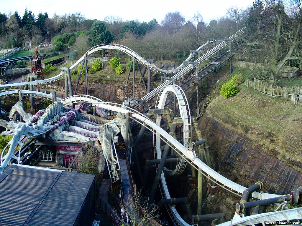
Here's the image and a link to the thread page:
[2024] Nemesis: General Discussion and Speculation
No, but with how the track colour ended up, I doubt it'll change my opinion of it that much. You generally have been determined to dislike everything so far this season so I doubt you will change your opinion one iota. I doubt it’s being painted entirely black, probably a base to build up...