What's new

New Unnamed RCT3 Park

A

Anonymous

Guest
I have started my first park, which hasn't got a name yet. Any name suggestions are welcome

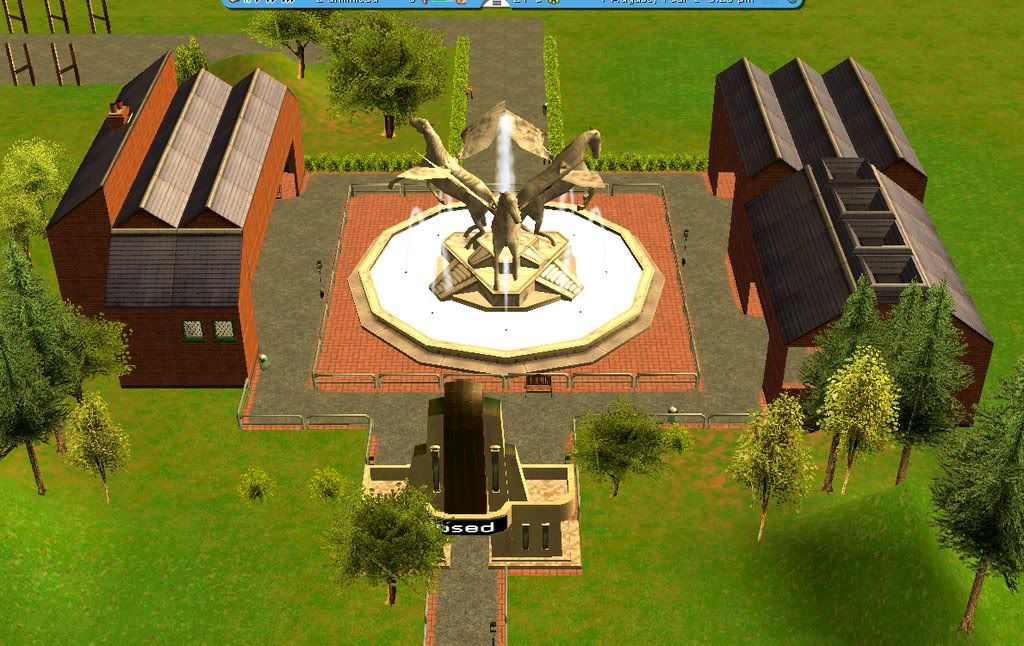
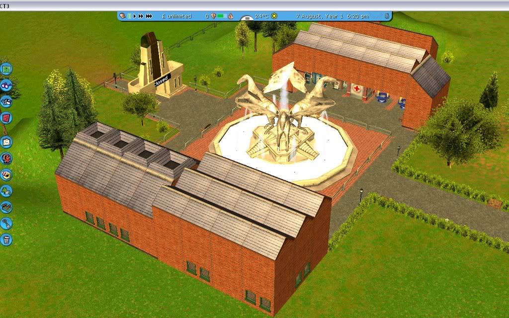
The Entrance - With a generic theme with brick buildings and a big fountain
5.jpg


6.jpg


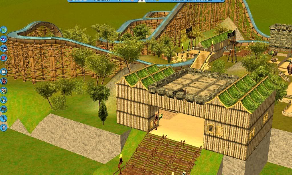
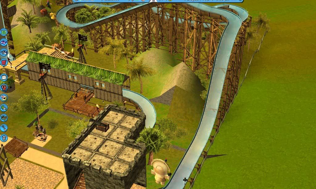
The first area, that has a Pirate / Jungle Theme, and contains 3 attractions.
This is the entrance to the area
untitled4.jpg


The first attraction is Treasure Hunt, a Log Flume with the quest of returning the lost treasure
untitled2.jpg


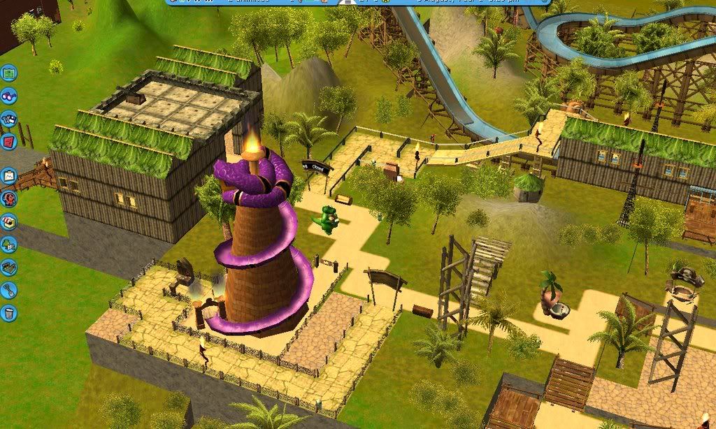
The second attraction is Slippery Sanke, a helter skelter for younger guests and maybe even older ones
untitled3.jpg


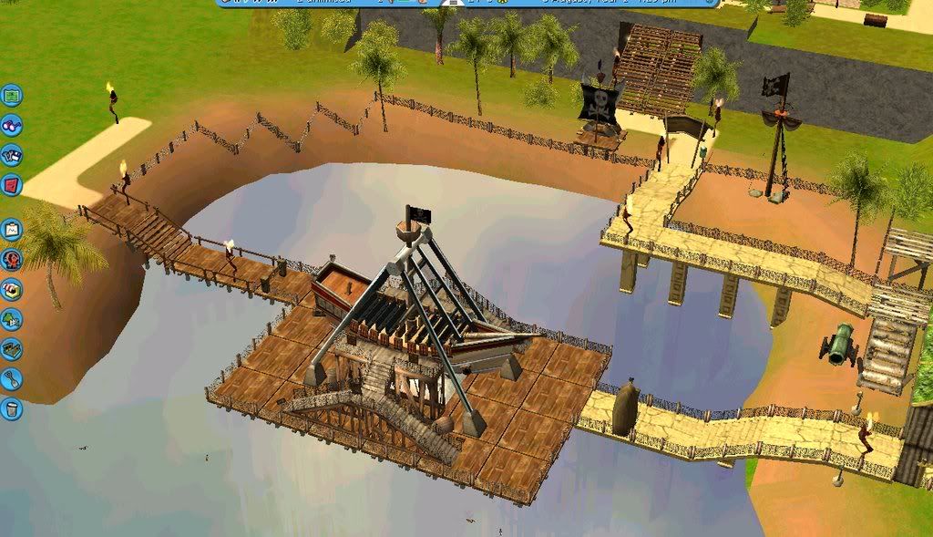
Lastly we have a Pirate Ship
untitled1.jpg


Enjoy! All ideas for improvements are welcome and please make any suggestions you feel could help
 

Brookes

Giga Poster
It looks brilliant so far mate. The entrance is good but I think it would look better if the buildings were a bit more variated and weren't as blocky. The rest of the entrance looks great though. The first area looks brilliant aswell, the buildings look fantastic, but as with the entrance they could be a bit less blocky, by adding extensions to them. On the third picture down, the walls need to be connected with the ground terrain to make it looks like the terrain is smooth and flows if you know what I mean. The three attractions look great and that log flume looks fantastic especially. I also like the idea of the pirate ship on the water, it looks awesome. Good work so far, keep it up.
 

#pmbo

Roller Poster
Good work, so far! ^ I also like the pirate ship on water. Did you get the idea from the RCT3 tutorial? I don't know if you should raise the ground so that the log flume supports don't show as much because they're ugly.
For me, the pegasis fountain doesn't look right; it's too big. Look at the lampost compared to the fountain. If it doesn't look too big to anyone else, then keep it in. It might just be me.
No other complaints from me, the park is looking good and has potential to become a great park.
well done
 

furie

SBOPD
Staff member
Administrator
Moderator
It's a grand start, but needs much...

The buildings are much too blocky and dull. It's best to add in funny odds and ends to add shape. Avoid the same roof tiles all the way around.

The simple triangle tops are hard to work with, as demonstrated by two of your buildings. One ends up long, thing and pointy, the other fat, short and hilly. Use different roof pieces to create a realistic effect. If a building needs to be two 'side' units high, then make it two side units wide too... Keep things a little more even so they don't look like they'd blow down in the wind.

Bascially avoid bif straight blocks of land... Don't leave straight edges of land showing. Curve, manipulate and change the landscape to look good.

The entrance is very poor I'm afraid. Imagine if you entered a park, and that was it. A couple of South London warehouses filled with bogs! You'd turn around and leave. Be flambouyant and excessive - this is your chance to shine in your park. Make th emost of it (yet do it tastefully)...
 
A

Anonymous

Guest
Thanks for the comments. Work in the next area is now underway. I also agree about things people have said about the entrance and I will change it. This is my first park so I know I will make mistakes and the buildings are obviously too blocky. Next update will be due in a few days and hopefully later updates will be more regular.
 

jokerman

Giga Poster
That log flume looks quite good. Overall the park is nice.

Try using F10 for photos, then you won't have to crop them badly.
 
A

Anonymous

Guest
Exposed Underground Surface

i would get rid of the EUS (exposed underground surface) and give it more of a realistic feel
 
Top